Friday, February 25, 2011

Maya


I haven't posted for a while because I haven't felt inspired enough to paint in recent weeks. One way to get the creative juices flowing is to choose a subject matter you are passionate about. I chose Maya, the dog that my fiancée and I have owned for over two years. She is a great dog and companion.

I started out trying to do an accurate value sketch, and it made the process easier. Using Picasa or any other simple photo software can convert a picture to black and white easily. This strips away the distraction of colour so that you can see just the values.

Although... I ended up thinking that the sketch captured the values more accurately. It was harder to be as faithful to the values using the paints.

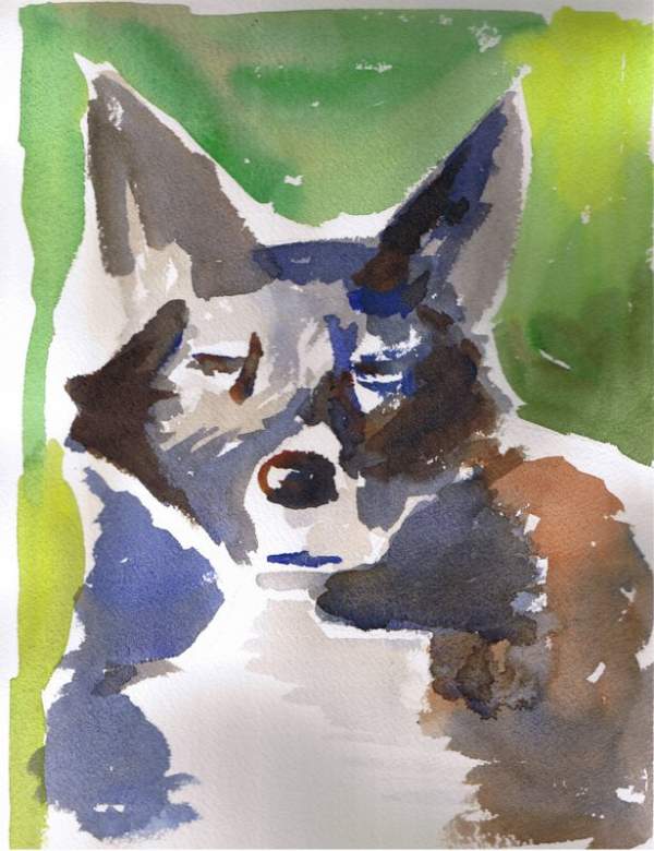
21 cm x 27 cm, Arches 140.


Monday, May 31, 2010

Spring Morning


I'm happy with the way the values turned out in this painting. Values are the relationship between light and dark areas in the field of vision. It's the hardest thing to get right in visual arts, but when you do it helps the painting to appear more 3D and "alive". Other details like palette and brushwork take a backseat to the values. Once in a while, I get it right.

This painting is really an exercise in "colour on grey". Greys are an effective way to offset and emphasize bright colours. The red and green I was using happen to make an effective grey when combined.

I achieved success in this painting by keeping it simple, but next I need to aim for something that adds more interest for the viewer, yet retains the loose, interpretive style that I'm aiming for.

Tuesday, May 4, 2010

The Ledge


When using blue and orange, the painting pretty much paints itself. Those two complementary colours are an artist's best friend. This picture was inspired by a view of the Alberta Legislature as I was driving past: the sun was obscured by a cloud but it created a gold halo. I almost wrecked the painting with a sloppy application of yellow, but the sandpaper saved the day!

Walk in the Park


Although it's a little overexposed, I'm fairly pleased with how this picture turned out. It had just rained and there was a brilliant setting sun when I was out for a walk. If I had to do this painting again, I would have probably been a little more sparing with the washes, especially on the trail and the beach.

Monday, February 8, 2010

Flowers in Study

This is a still life that isn't really exciting, but I'm trying to loosen up my painting style anyways. The amount of white in the painting was a little hard to take at first, but I'm used to it now because it keeps the painting looking "light" and prevents it from looking overworked.

Grey is often important for paintings, sometimes to form a cool background to allow the colours to take centre stage.
Posted by Picasa

Saturday, January 9, 2010

Tree on the Prairie

This painting was a lot of fun! It is meant to evoke the starkness and the vastness of the prairie winter landscape. The tree is there for perspective, and I'm pleased with the results. It's hard to paint something simple that still works, but that's what I was trying to achieve here.
Posted by Picasa

Thursday, December 3, 2009

Quiet Evening at Home


This painting was inspired by the feeling of sitting at home in the evening and seeing the soft lights in my living room glow from the soothing mauve-coloured walls. The subject material is admittedly a little dull, but the colours are waht make this painting: a classic complementary colours work. If I had to do it again, I might use an angled perspective to give it more depth and interest.
Posted by Picasa